Tzu Yin Tai & Xin Zhou
- Introduction
The original paper [1] is published by Google in 2010, which proposed to increase TCP’s initial congestion window to at least ten segments in order to complete web requests quicker. While the Internet scale and bandwidth has grown dramatically these years, TCP’s initial congestion window has not changed at all. This paper aims to give sound justification to show that TCP’s initial congestion windows should be increased to fit today’s networking environment and to reduce web latency.
TCP flows usually start with an initial congestion window of at most four segments (typically three segments). However, most web transactions are short-lived, so initial congestion window size is very critical in determining how quickly such flows can complete. These short-lived TCP flows completed while they are still at slow-start phase, and many browsers open multiple simultaneous TCP flows to download webpages faster. If initial congestion window is increased, webpages can be fetched quicker and there’s no need to open multiple simultaneous TCP flows to circumvent the small congestion window size.
This paper conducts experiments that change the initial congestion window from three to ten segments, and found that doing so will largely improve the average latency. They found that there is an average latency improvement of 11.7% in Google data centers and 8.7% improvement in slow data centers. They also showed the the latency improvements across different buckets of subnet BW, RTT, and BDP, and found that high RTT and high BDP networks have the most improvement while low RTT has the least improvement. On the other hand, they also found that there can be a negative impact of increasing retransmission rate.
- Subset Goal and Motivation
The main result we’d like to reproduce is the first two graphs of paper’s Figure 5 (Average response latency for Web search bucketed by RTT, and BW at AvgDC):
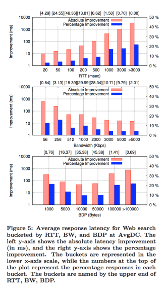
We did not reproduce the third graph which shows the improvement bucketed by BDP mainly because we don’t know the bandwidth and delay they used for each BDP. In fact, since Google monitored real traffic in data center, each BDP result they got used a lot of different bandwidth and delay combination, and we do not have the joint probability distribution of it.
We want to reproduce this result because the main purpose of the paper is to show that increasing initial congestion window size will improve latency across a wide range of conditions, and Figure 5 captures exactly this.
- Experiment Setup
We used Mininet to set up the experiment on a Google Cloud virtual instance. The Mininet topology consists of a server, a client, and a switch connecting them. The initial congestion window (3 or 10) is configured using the initcwnd option in the ip route command, and the default congestion control algorithm we used is TCP CUBIC. We also set the initial receive window to 27 segments (40.5KB), which is roughly equal to the Windows 7’s average rwnd (mentioned in the paper’s Table 2). We did this because Linux has an average rwnd of 10KB which is not large enough, and Windows 7 is the most popular OS.
- Subset Results
We used a fixed response size of 9KB to reproduce these two graphs. This is because from the Figure 1 in the paper:

We can see that about 60% of Google web search response size is around 8KB to 10KB, so 9KB is pretty representative. When reproducing results for a fixed RTT, we actually varied the bandwidth, and different bandwidth are given different weights to calculate the final result. The weight (percentage) we used is the row of numbers shown in the second graph (Bandwidth graph) in paper’s Figure 5:
| BW (kbps) | 56 | 256 | 512 | 1000 | 2000 | 3000 | 5000 | >5000 |
| percentage | 0.64 | 3.13 | 15.39 | 29.99 | 28.34 | 10.71 | 9.79 | 2.01 |
Similarly, when reproducing results for a fixed bandwidth, we also varied the RTT using the weight (percentage) shown in the first graph (RTT graph) in paper’s Figure 5:
| RTT (ms) | 20 | 50 | 100 | 200 | 500 | 1000 | 3000 | >3000 |
| percentage | 4.29 | 24.55 | 48.36 | 13.81 | 6.62 | 1.58 | 0.70 | 0.08 |
Below are the RTT and BW graphs we’ve reproduced:


The RTT graph is very similar to the one in the paper. However, for RTT = 1000 and 3000ms, there is no improvement. This is because the initial retransmission timeout (RTO) is set to 1000ms (as specified in RFC 6298 [2]), and when retransmission happens cwnd falls and basically cancel out the effect of having higher initial cwnd. Beside that, the RTT graph matches the original graph in terms of trends and values.
For the BW graph we’ve reproduced, it doesn’t match with the original graph. When monitoring real world traffic, network with higher bandwidth usually have lower RTT and vice versa. Hence, in the paper when bandwidth is high, the improvement is less, and this is because RTT is probably also lower so larger initial cwnd results in less improvement. Similarly, in the paper when bandwidth is low, the improvement is more, and this is because RTT is probably higher so larger initial cwnd results in more improvement. On the other hand, in our simulation, the trend is opposite. The higher the bandwidth, the more the improvement. This is mainly because when we do the simulation, we are assuming RTT and bandwidth are independent, and didn’t take into account that high bandwidth usually means low RTT and vice versa.
Beside reproducing these two graphs, we’ve also created our own graph which shows the improvement under different response sizes: 2, 9, 20, 40KB (beside the response size, other settings are the same):

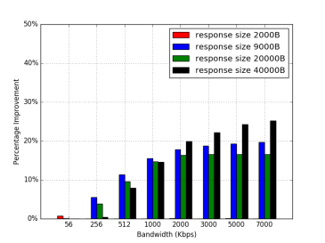
We plot these two extra graphs because we are interested in seeing what happens when response size is lower than 3 segments, around 10 segments, and over 10 segments. As expected, when response size is 2000B, there is basically not improvement since 3 initial cwnd is enough. For response size greater than 3 segments, there are more improvement. An interesting point here is that when response size = 20000B, its percent improvement is lower than response size = 9000B. However, for response size = 40000B, the percent improvement bounce back up. While the percent improvement drop, the absolute improvement (not shown here since it will make the graph more confusing) doesn’t really drop. The main reason why percent improvement drops is because 20000B is just a little above 10 segments, and in this case the difference of RTT rounds between 3 segments and 10 segments are not as large as the 40000B case. That is, RTT rounds can only be in unit of integer, but not fraction, so percent improvement may drop at a particular spot, which in this case is around 20000B.
- Challenges
One challenge we’ve encountered is to simulate an environment as close to the origin setup as possible. When Google did the experiment, the collect data from real traffic going through data center. Hence, there are flows with different delays and bandwidths combinations. It’s not realistic to create thousands of flows in our setup, not to mention that we don’t know the exact distribution of delays and bandwidths since the paper didn’t give it to us. The paper gave us the median RTT = 70ms and median BW = 1.2 Mbps. We could’ve just used these two values, but we want to do better. We noticed that on Figure 5 it mentioned “the numbers at the top of the plot represent the percentage responses in each bucket.” Hence, we use these two rows of value as a rough estimate of what percentage of flows have what RTT and what BW. We’ve made the assumption here that RTT and BW is independent, while it reality it probably isn’t. Also, in practice the distribution of RTT and BW is continuous, but we made it a 8-piece piecewise function. We think this is a lot better than use fixed RTT = 70ms and fixed BW = 1.2 Mbps, but of course it’s not perfect. This becomes especially obvious when looking at the difference between our BW graph and the paper’s BW graph. We have the opposite trend compared to the paper. As mentioned previously, this is because RTT and BW are highly correlated in practice and vice versa, but we don’t have a good way of simulating it. Similarly, we are not able to reproduce the third graph (BDP graph) because we don’t know the joint probability distribution of BW and delay.
Another challenge we’ve encountered is to decide what response size to use. The Figure 1 in the paper shows a distribution of response size. Most of the response sizes for Google web search falls around 8000 to 10000B thousands, so we can choose to just use 9000B. Or we can try to sample a few different values from the distribution. We tried sampling 5 values from the distribution (2000, 7000, 8000, 9000, 10000), and the result is basically the same as just using 9000B. If we really want to get better average, we probably should sample 20 values. However, we are already running a nested for-loop in our experiment (since we vary both RTT and BW), and if we sample 20 values, the experiment is going to take like 2 hrs. We also think that 9000B is pretty representative and already produced a close-enough result, so we decided to just use a fixed 9000B response size.
Also, for the case where RTT = 3000ms and 5000ms, there is no improvement at all, which contradicted with the paper. We found out that this is because the initial retransmission timeout (RTO) set in the kernel is 1s (according to RFC 6298). To fix this, we will have to recompile the kernel. We decided not to do so because we think the graphs we reproduced already shows the same trend as the graphs in the paper and is already convincing. Also, cases where RTT > 3000ms only made up 0.78% of all flows, so it is not as critical.
- Critique
We found that the major claim of this paper still holds strongly. That is, increasing initial congestion window from 3 segments to 10 segments can reduce the average latency of HTTP responses. From our replicated result, we can see that there are improvements for different RTTs and bandwidths. This result is very intuitive; higher initial cwnd means less RTT rounds so the request can be completed faster. Of course, our results for BW graph is different than the paper, which is mostly due to the high correlation between RTT and BW in practice. We also plot two additional graphs which show the improvement under different response sizes. We did so because we want to check what happens when the response size is lower than 3 segments, around 10 segments, and over 10 segments. The result is as expected here, and the trends are also similar to our previous graphs.
- Platform
We used Mininet to set up the experiment on a Google Cloud virtual instance. We chose Mininet since we’ve used it before, and it has all the functionalities required to reproduce the result. The Python version we used is Python 2.7, the virtual instance specification we used are: 4 vCPUs, 15GB memory, zone = us-west1-b, Linux 16.04 LTS, and we allowed HTTP/HTTPS traffic.
- README
To reproduce the result:
- Create a Google Cloud VM instance (under compute engine) with the following specification: 4 vCPUs, 15GB memory, zone = us-west1-b, Linux 16.04 LTS, allow HTTP/HTTPS traffic.
- Clone our code on Github: git clone https://github.com/g60726/CS244Lab3
- cd into CS244Lab3, then run “chmod +x *.sh” to make shell scripts executable.
- Run “sudo ./install.sh” to install Mininet, Python 2.7, numpy, matplotlib, argparse.
- Run “sudo ./run.sh” to run the simulation. It should take about 15 – 20 minutes. Once done, the two figures for RTT and BW will be in the figures folder.
- Optional: run.sh only reproduce our main results for paper’s Figure 5, but doesn’t reproduce the additional result we’ve included which test for different response sizes. If you want to see the improvement under different response sizes, you can change the response size in webserver.py (change “a * 9000” to “a * x” where x is whatever response size you want), and you can see different results by looking at the new figures (inside “figures” folder). If you want to reproduce the extra graphs, you will have to rename the “results” folder generated for each response sizes to “results_[size]”. At the end, you should have “results_2000”, “results_9000”, “results_20000”, and “results_40000” folders. Once you have these folders, you can run “sudo python plot_extra_figures.py” to reproduce the two extra graphs (should show up in current folder). Doing this is optional since it will take a lot more time to run all the different response sizes (about 1 hour) and it’s not the main results we are trying to reproduce.
Note: when we are testing the above instruction ourselves, occasionally we saw “Fontconfig warning: ignoring UTF-8: not a valid region tag” when running run.sh. However, this doesn’t seem to affect any figures or results.
- References
[1] Dukkipati, Nandita, Tiziana Refice, Yuchung Cheng, Jerry Chu, Tom Herbert, Amit Agarwal, Arvind Jain, and Natalia Sutin. “An argument for increasing TCP’s initial congestion window.” Computer Communication Review 40, no. 3 (2010): 26-33.
[2] V. Paxson, M. Allman, J. Chu, M. Sargent. “Computing TCP’s Retransmission Timer.” Internet Engineering Task Force. June, 2011. Accessed June 1, 2017. https://tools.ietf.org/html/rfc6298.

We forgot to include our email in the post. If you encountered any problems reproducing the results, please feel free to contact us at ninatai@stanford.edu. Thanks!
Reproducibility: 5/5
We found the instructions straight-forward even though they were not wrapped in a single script and we did not encounter any issues running your code. We replicated both the basic results and the extensions and found that the graphs match near-perfectly the ones in the report. Overall, we believe the experiment is set up well and demonstrates understanding of the original paper.
Best,
Hristo Stoyanov and Petar Penkov